Luska v0.1
The idea for Luska originated in 2021 during a Typecooker session from the Letrastica Comunidad, using a recipe created by Javier Alcaraz. The recipe suggested letters with low contrast, very expanded shapes, and tuscan serifs. Additionally, it called for an L with a bar, characteristic of the Polish language, which led me to draw the word Łuska, meaning "scale" or "shell casing."
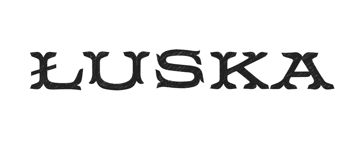
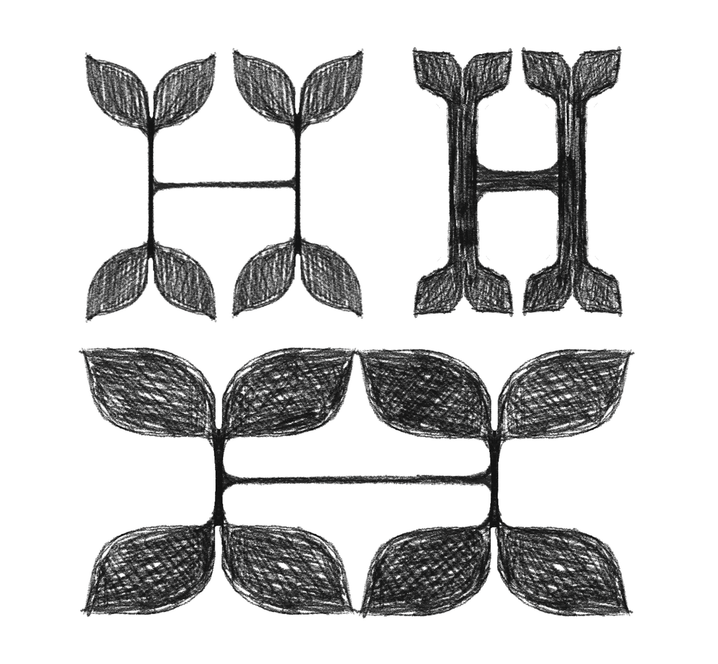
I was particularly pleased with the final piece, especially the tuscan serifs that remind me of tree leaves. This resemblance inspired me to experiment with the serifs, making them larger and more prominent, like blooming petals.
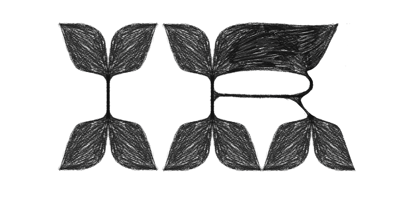
The initial exploration featured letters with very extreme reverse contrast, characteristics common in late 19th-century Italian styles. This naturally led me to associate them with wood type, particularly Brylski by Nick Sherman and Archimedes by James Grieshaber (a revival of Page No. 122), both from the Hamilton Wood Type Collection.
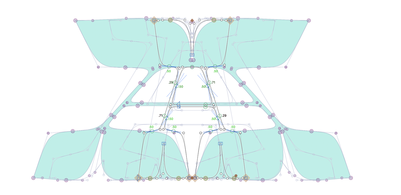
The original drawing had low contrast and very extended proportions, so I decided to create three other extremes to complete a prototype design space: high contrast-very expanded, compressed-high contrast, and compressed-low contrast.
These sketches gave me the idea to create a variable font that could navigate between these extremes. Achieving this aspect correctly took a long time due to the extreme variations involved.
Zrinka and I are still figuring out how to design certain symbols and are undecided about adding lowercase letters to the project. For now, we are satisfied with the base design and the way the variations flow. Luska is a typeface that is not very usable but highly expressive. We hope you enjoy it.