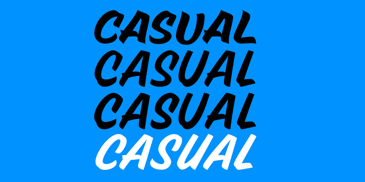
Dual Casual: A Journey of Evolution and Learning
Support the development of Dual Casual
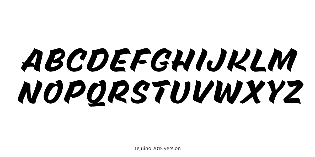
This project has been a bumpy road, full of ups and downs. The idea first emerged in 2015 with the goal of designing a personal typeface that paid homage to the casual brush letters and reflected my fascination with sign painting. That initial version, named Tejuino, was both naïve and sincere, yet also chaotic and unrefined. Despite my best intentions, over time, I lost connection with its original concept. However, beyond its informality, it became a valuable learning experience, helping me gain confidence in type design software. This version clearly showed that my enthusiasm outweighed my skill.
A New Approach
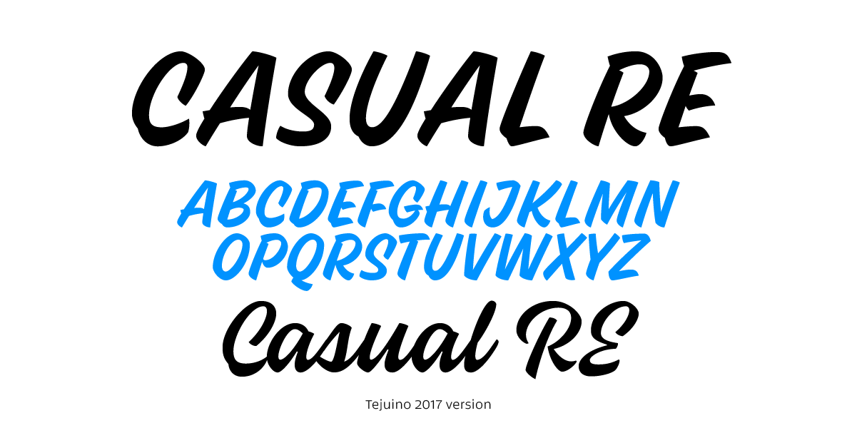
In 2017, I decided to start over with a more structured and consistent approach. This new version had a clearer systematization but still felt somewhat unpredictable. At times, its brush-inspired construction was evident, while in other moments, it leaned more toward a cursive feel. This phase led me to explore the idea of developing two versions: Casual and Casual Cursive.
The Project Reborn
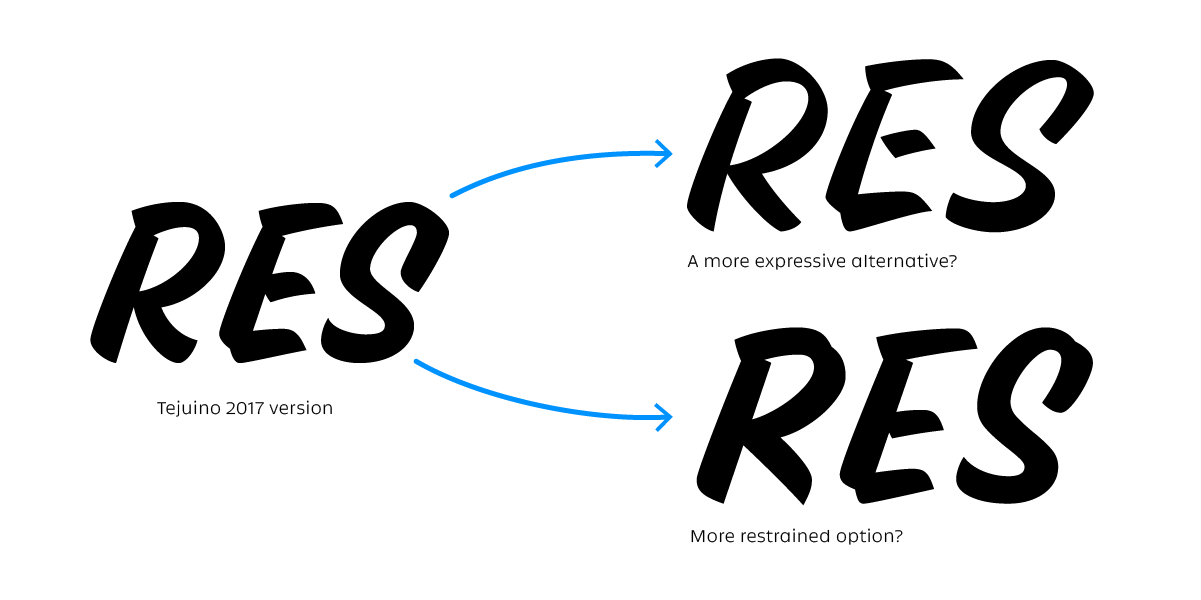
After several years on the shelf, I returned to the project in 2024 with a more refined and structured vision. Although I liked the previous version, using it often left me uncertain—should it be more formal or more expressive? I was drawn to experimenting with contrast variations, yet the project itself seemed to demand something more aligned with traditional sign painting. Ultimately, I chose the latter path: to redesign the Casual version with greater coherence and restraint, bringing it closer to its original inspiration while setting the cursive version aside for a future project.
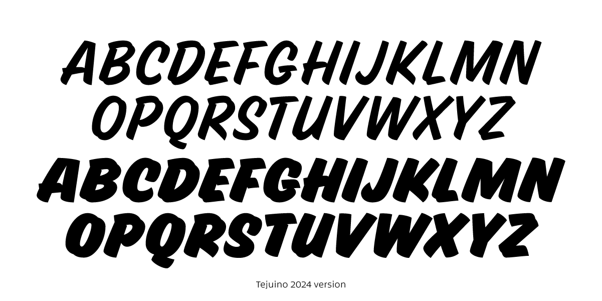
This wasn’t just a refinement—it was a complete redesign. This time, I stayed much closer to the natural forms of the brush while building a more robust typographic system. The typeface was developed with two masters, from Regular to Black, maintaining the 20° slant from previous iterations.
The Transformation into a Variable Font
Though satisfied with the outcome, I once again faced a familiar challenge: in different contexts, the typeface seemed to need more versatility. Sometimes it felt too static, other times too serious. After reflecting and discussing it with Zrinka, I decided to evolve what had started as a modest project into a variable font with 12 masters and 3 axes:
- Slant: 0° to 40°
- Weight: Light to Black
- Width: Condensed to Regular
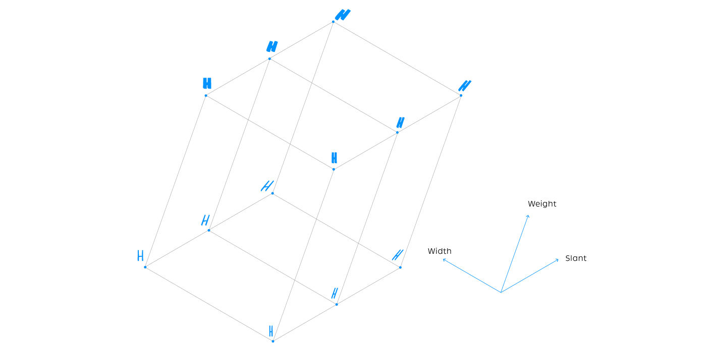
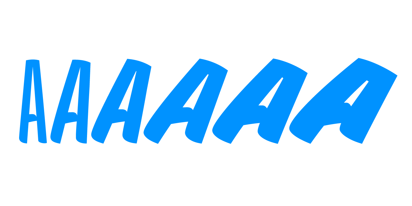
One of the biggest challenges was ensuring stylistic and structural consistency across all variations, especially in the heaviest and most inclined styles.
Refinement and Adjustments
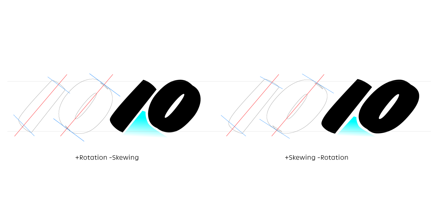
Throughout the process, I consulted John Downer, whose keen eye quickly identified many issues, particularly in the extreme instances. A rotation-based transformation, rather than a skewed one, was creating spacing issues between letters. Following his advice, I adjusted the underlying formula to prioritize skewing over rotation. This change significantly improved both the visual cohesion and the typographic rhythm.
While I still toy with the idea of adding extended widths, I’ve struggled to find satisfying solutions at the more extreme weights and angles. Even without the need for an extended width, I’m extremely pleased with the design space I’ve achieved. It has been a challenging but incredibly rewarding journey.
I hope that when you use this first release of Dual Casual, you’ll enjoy it as much as I do.