Back to Padova
Padova is one of those projects that begin with a clear premise but gradually lose direction. You start with a solid idea, but then get distracted by things that don’t really matter. You sense something’s not quite right, you ignore it, the process gets stuck, and eventually, you abandon it.
It is worth pointing out that this project was my first attempt at designing a text typeface. Developed as the main project during the Type@Cooper West program in San Francisco, it dates back quite a few years.
You know the saying, “Don’t bite off more than you can chew”? Well, Padova was exactly that. At the time, I didn’t have the visual or technical skills to carry out a project like this—but I did have the energy (and the innocence) to believe I could.
Today, I no longer have that innocence, but at least I have the audacity to try again.
Sanvito as starting point
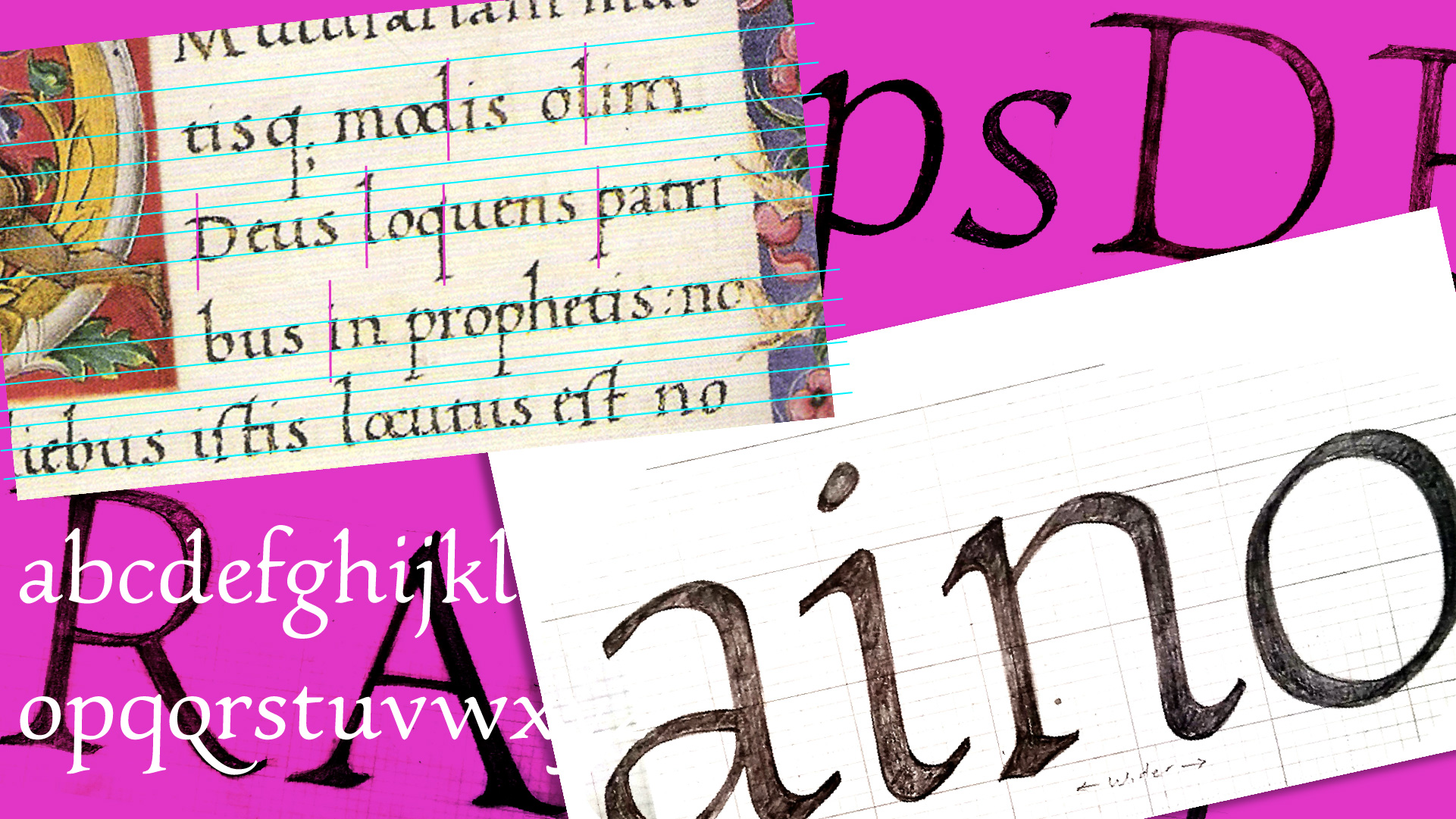
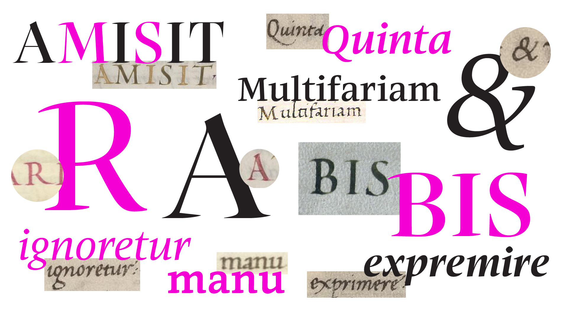
The idea came from my fascination with the manuscripts of Bartolomeo Sanvito, which we studied in Ewan Clayton’s class. Sanvito’s story is fascinating. Born in Padua in 1433 and trained in Gothic cursive, he later developed a distinctive italic script style, first documented in the mid-1450s. His work quickly caught the attention of leading Venetian Humanists and wealthy patrons.
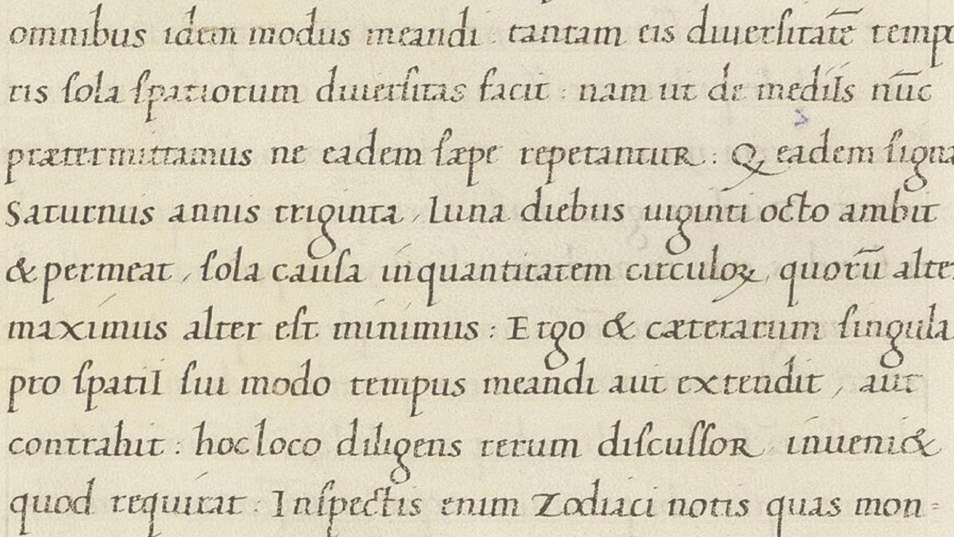
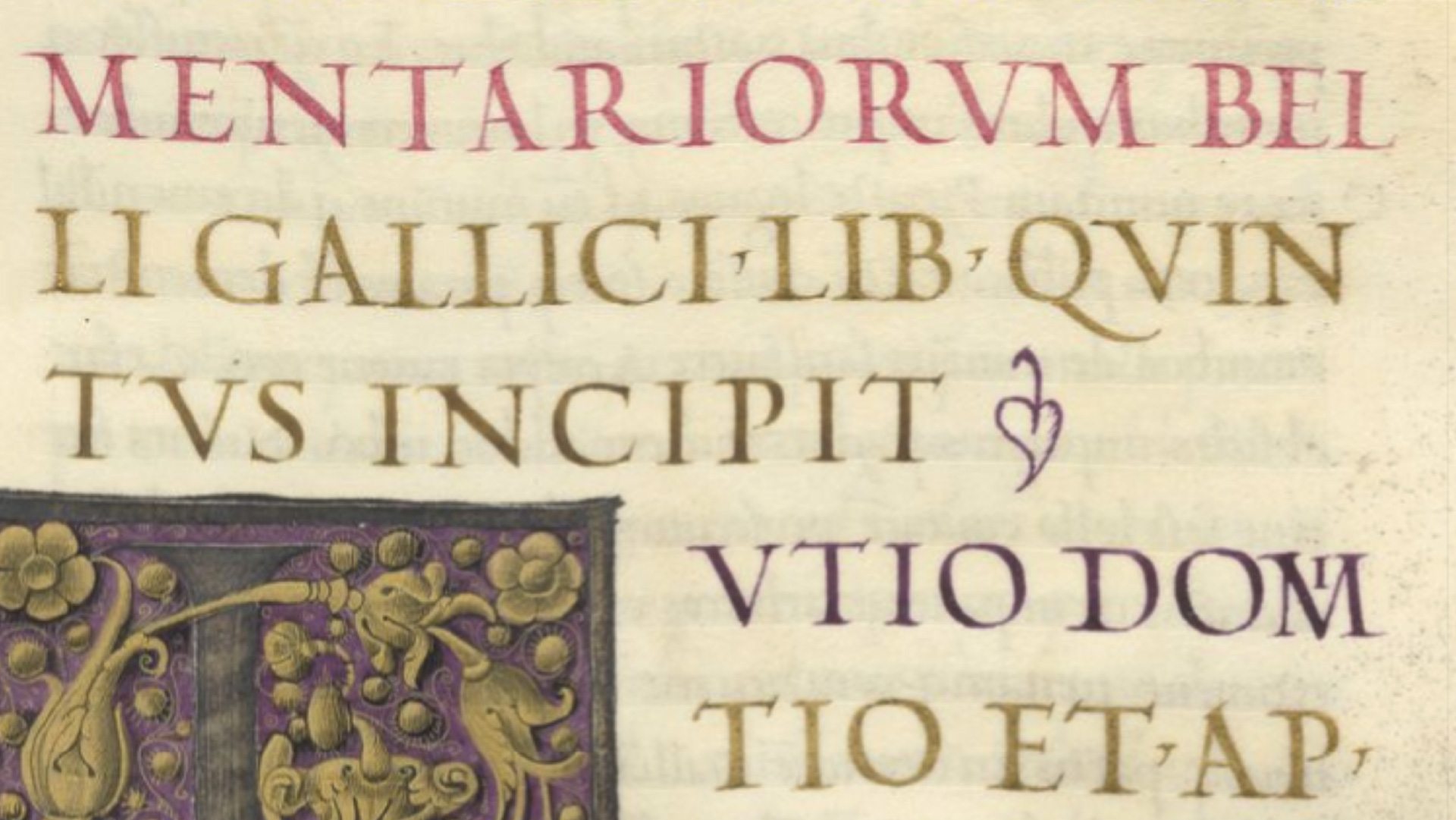
While his style wasn’t entirely unique, since he was part of a regional calligraphic movement in Padua, his execution had a distinctly personal touch, especially in his capitals and certain stylistic choices. One of his trademarks was the use of alternating colored capitals. He didn’t invent the idea, but he refined it, moving from stiff early imitations to fresher and livelier forms.
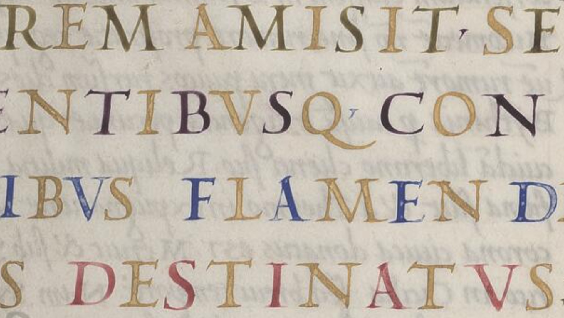
Like many Renaissance artists, Sanvito was drawn to the idea of reinterpreting Classical Roman heritage. But instead of simply copying classical forms, he approached them in a way that felt more expressive and craft-driven than purely rational. Unlike colder, more monumental interpretations of the inscription on Trajan’s Column, his capitals had a warmth and personality. They were vivid, playful, sometimes even whimsical, but always beautifully refined.
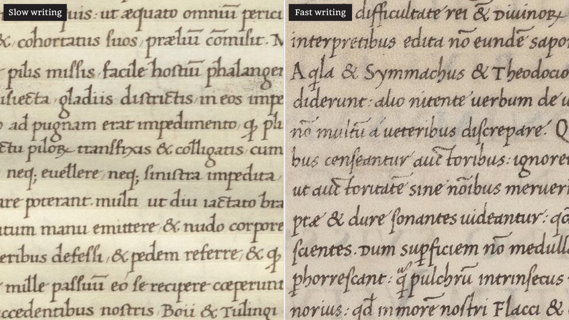
Although his capitals are what he’s best known for, his lowercase letters are just as interesting. In modern terms, his script could be described as a hybrid between upright and italic forms. While many of his contemporaries had already moved toward fully cursive italic styles, Sanvito’s hand combined the structure of slower, more deliberate writing with the fluidity of faster script. His work moved between the grace of speed and the careful control of slow execution, which became one of his signature traits.
Some scholars believe the first Roman metal typefaces may have drawn inspiration from his calligraphy, or from styles very close to it. Nicolas Jenson’s movable types, for example, share clear similarities. Beyond aesthetics, early type design also had to respond to technical constraints. Turning a handwritten letter into a metal glyph meant rethinking the shape.
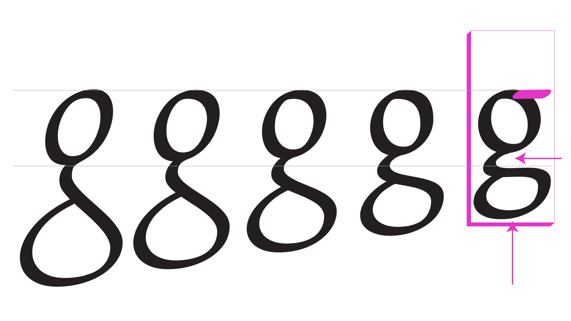
A good example is the lowercase g. If Jenson’s design was influenced by Sanvito’s, you can see how the scribe’s large, rounded tail, like a hanging pouch, would have been tricky to fit into the tight space of a type block. The form had to be flattened, the neck shifted to the side, and an extra element added to balance the shape. In many ways, what we now think of as “classic” in Latin type design came not only from style choices but also from adapting to the technology of the time.
With Padova, I wasn’t trying to copy Sanvito’s hand, but to create a contemporary interpretation that worked within today’s technological conventions. My goal was to study his calligraphy in depth and design a usable, modern typeface that could capture the tone and personality of his manuscripts without reproducing the exact letterforms.
A Process of Many Missteps
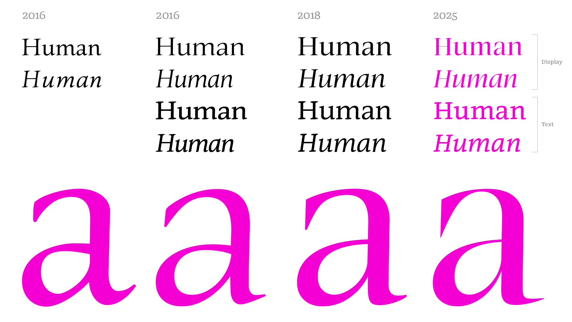
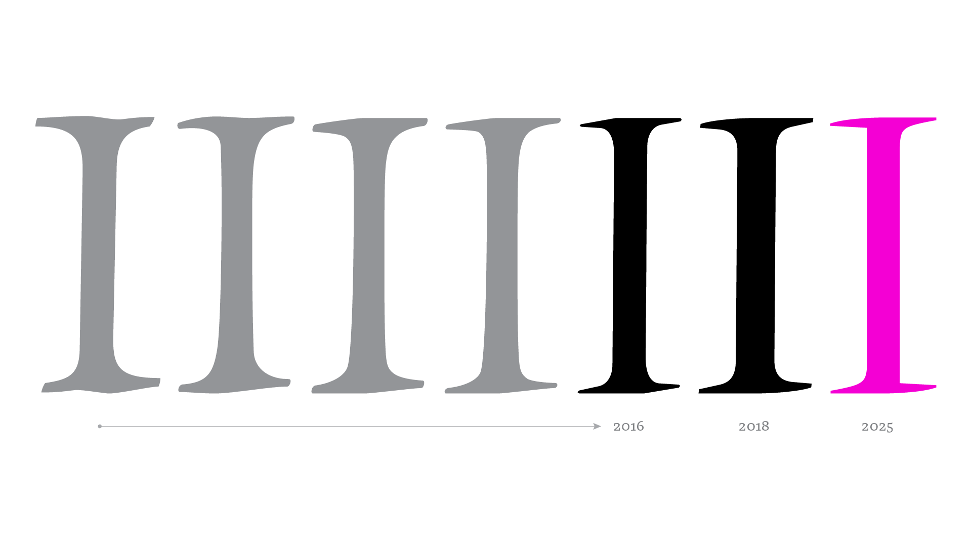
This project has gone through more than a few false starts. The first attempt, back in 2016, went by the name Victus. It had a certain charm, but it often felt indecisive, flat, and a little insecure, as if it could not quite figure out what it wanted to be. In 2018, I tried pushing it to the extremes of weight and contrast. That did not go so well either. The heaviest weights ended up feeling awkward, and the text styles were overly dense. This version did get closer to Sanvito’s calligraphic personality, but it never sat right with me, and eventually I stepped away from the project.
When I came back to it, my main challenge was to define the project’s personality once and for all, finding the right point between something written and something typographic, between functional and expressive.
The first thing that caught my attention was the serifs. In Sanvito’s calligraphy they have a very particular character, with transitional strokes from a broad nib that sometimes show a gentle wave. Even after studying them closely, my first design attempts were clumsy. I focused too much on the outline and not enough on the structure that gave them shape. Before long I let go of the idea of “organic” serifs and moved toward a more abstract form that felt truer to the direction the project needed.
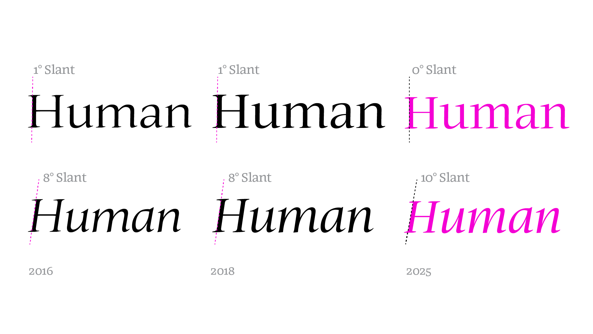
In the earlier versions, the relationship between romans and italics was one of the most noticeable quirks. The italics were wide and rounded, and the romans had a one degree slant. The idea was to echo the spirit of his manuscripts, but in practice it only made everything harder. For this last version, I made the italics more condensed and lighter, and the romans returned to a fully upright stance. That small change brought much needed balance.
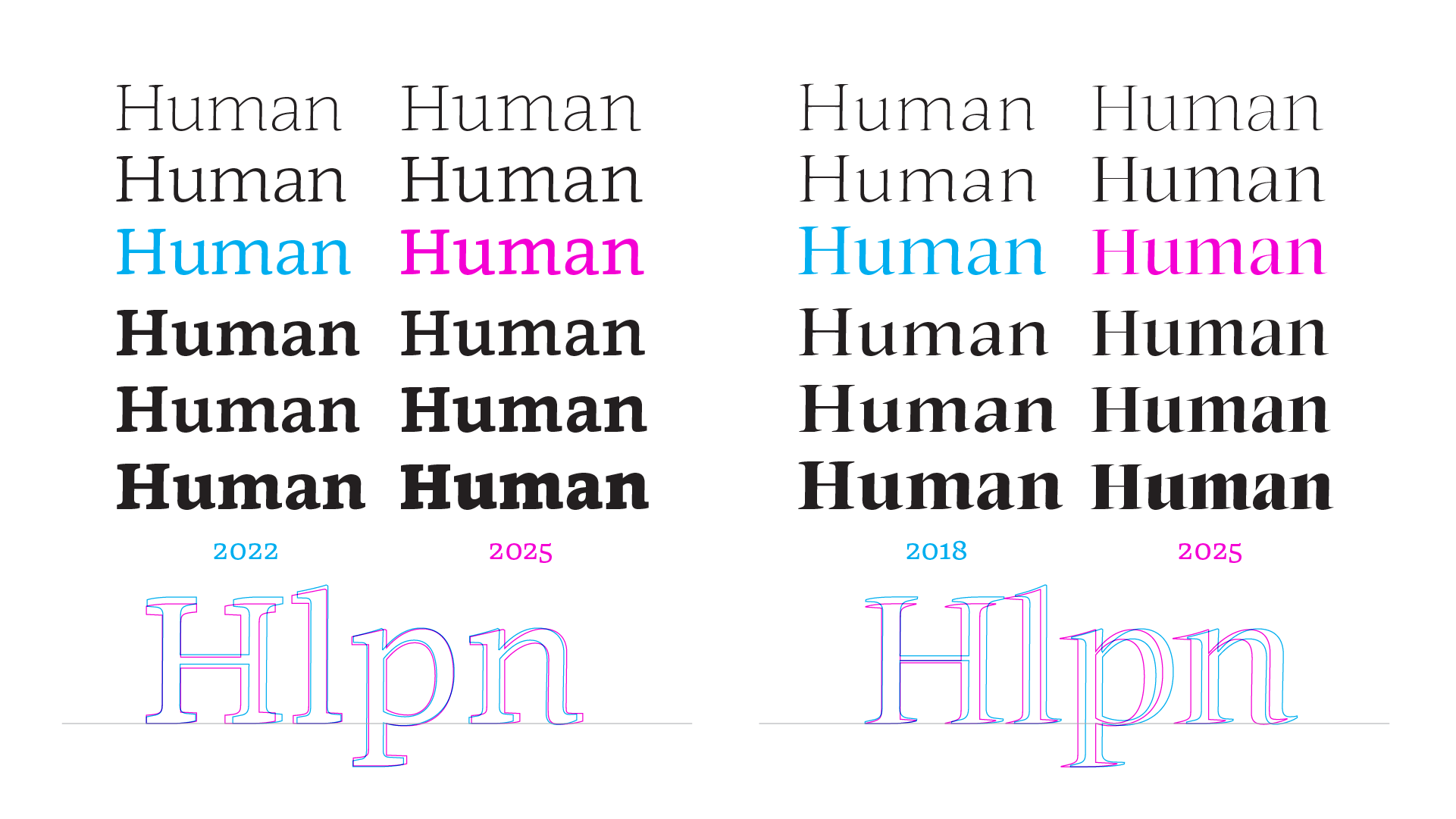
The idea of having two subfamilies, Text and Display, had been there since 2016, but I had never tested it. There were no performance checks, no side by side comparisons. I simply trusted my instincts. The result was a Display that felt flat and a Text that felt stiff. So I started fresh with new adjusted proportions. This time I focused on creating a brighter and more lively Display and a Text that was clearer and lighter. I also redefined the design space and redefined the Black weight to ensure a more stable and consistent variable version.
Looking back, sure, there were a few stumbles along the way, but honestly, it wasn’t that messy. Each step brought me closer to understanding what this typeface needed to be. This version might not be perfect, but it’s the last big redesign. From here on out, it’ll get tweaks and updates, but no more overhauls. Sometimes you just have to draw a line and say “This is good enough to move forward”.