The Design Behind Raketa
Back in 2016, I attended a workshop with Carl Rohrs that really stuck with me. We explored the close relationship between typography and calligraphy—how they’ve influenced each other over time and evolved together.
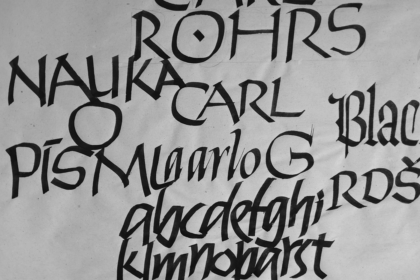
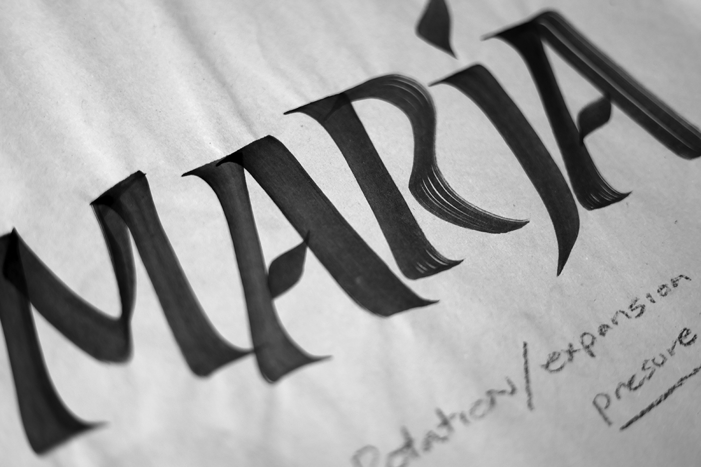
That experience sparked a deep dive into brush calligraphy, where I started breaking down how speed, slant, and modulation shape letterforms. As I worked through different exercises, certain strokes stood out—they had something special, something worth exploring further.
That exploration naturally led me to the spirit of mid-20th-century design and the work of Roger Excoffon, Oscar Ogg, and Oldřich Menhart. Their approaches—full of energy, craftsmanship, and a strong connection to calligraphy—found their way into Raketa’s DNA in subtle but meaningful ways.
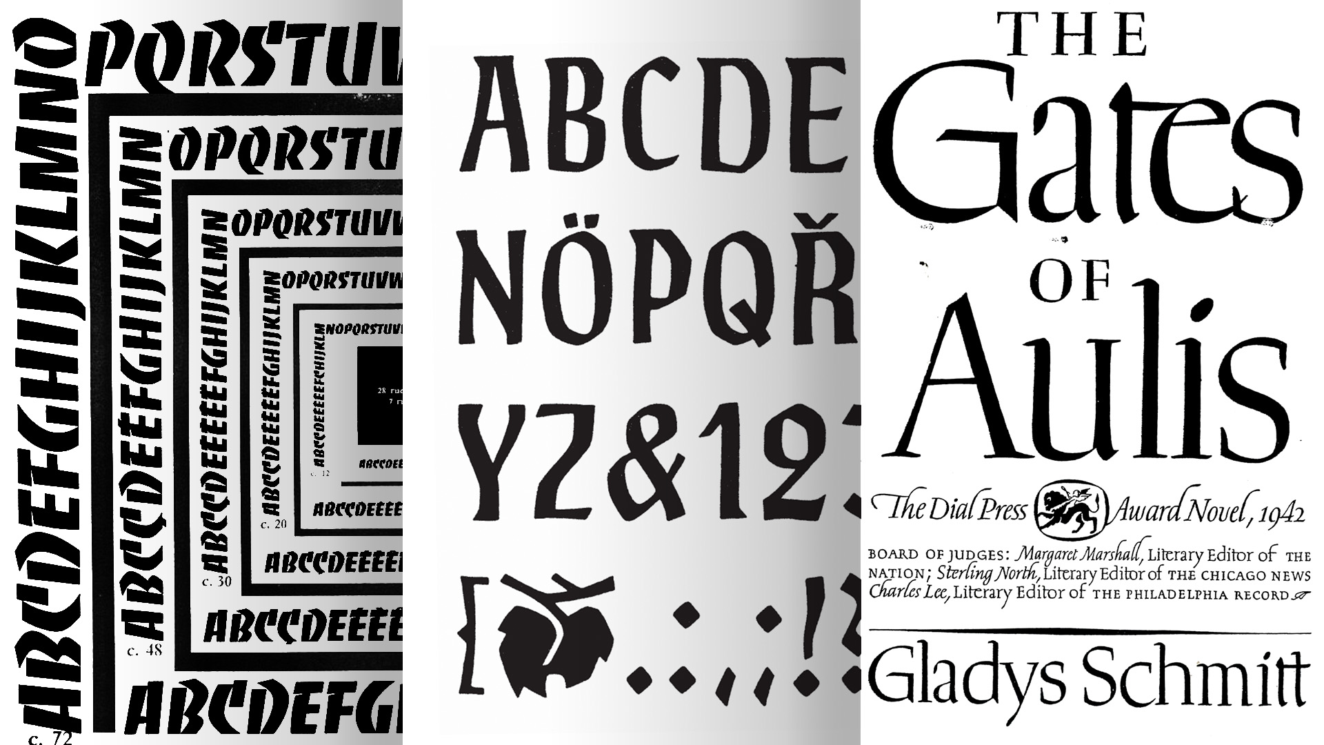
Excoffon’s knack for bringing movement and personality into type was especially inspiring. Raketa carries some of that influence, with rhythmic strokes and a sense of fluidity that echo the dynamic feel of Banco. Oscar Ogg’s work, while not a direct stylistic influence, left an impression through his focus on craftsmanship and the strong calligraphic foundation of his letterforms. And then there’s Oldřich Menhart—his sculptural, calligraphy-driven approach played a key role in shaping Raketa’s contrast and modulation, giving it more depth and presence.
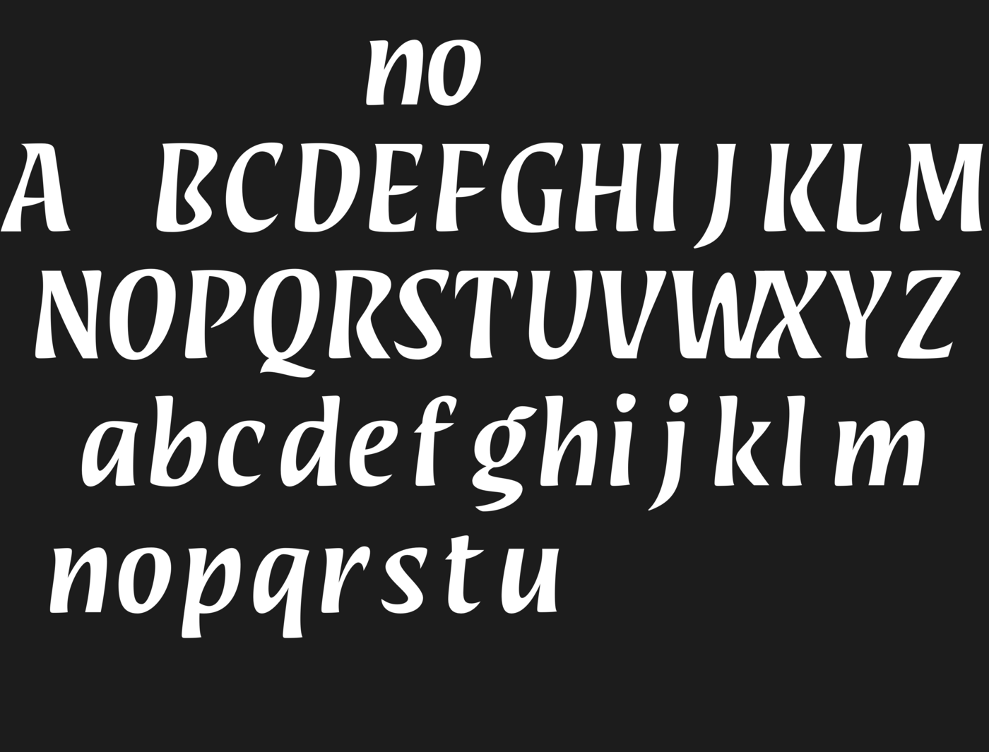
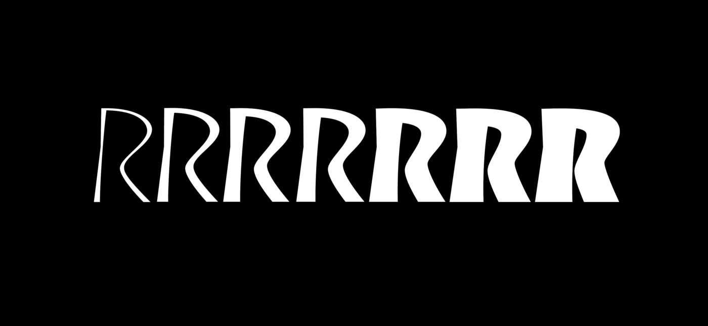
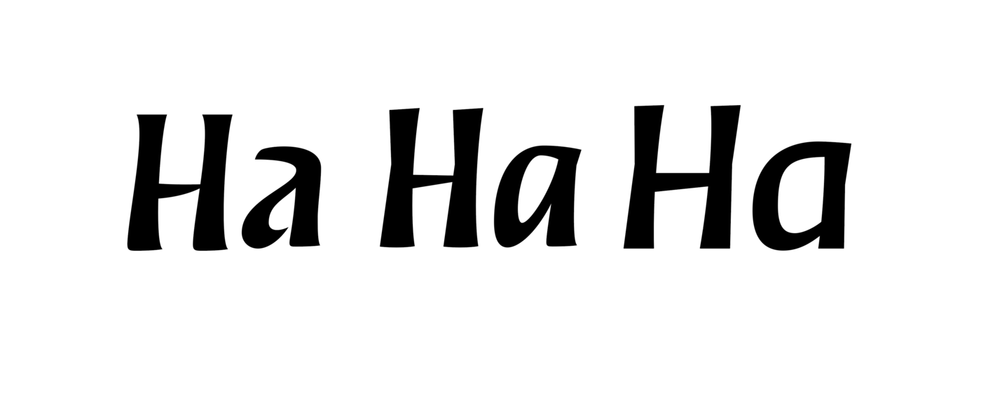
Even though I had a well-formed idea in my head, the toughest part of designing Raketa was figuring out its personality. My early sketches followed the brush closely, but something felt off—they were too wavy, a little chaotic, and just didn’t feel grounded.
I kept refining, trying different approaches, but it wasn’t clicking. Then, after countless iterations, I landed on a double-stroke variation—more structured, sharper, with less of that loose, curvy feel. That was the moment Raketa’s true character started to take shape.
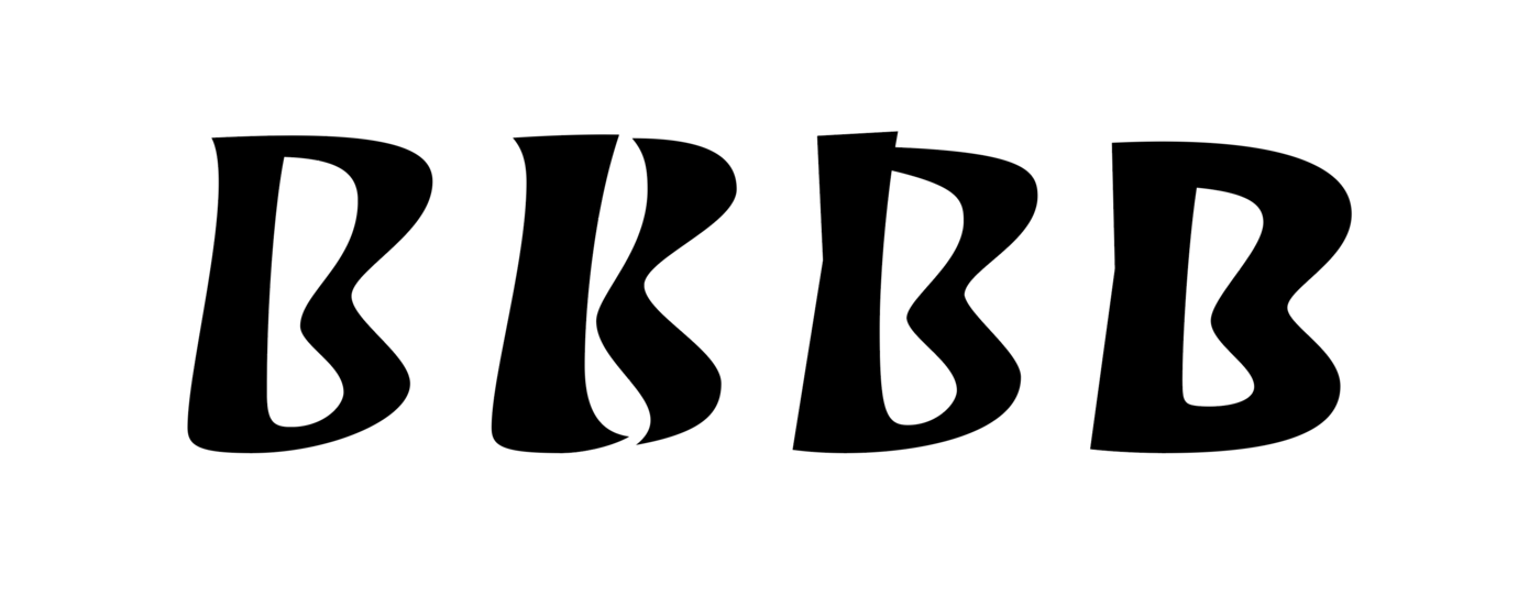
While the double-stroke style served as the foundation for defining Raketa’s personality, this style remains in the early stages of its development.
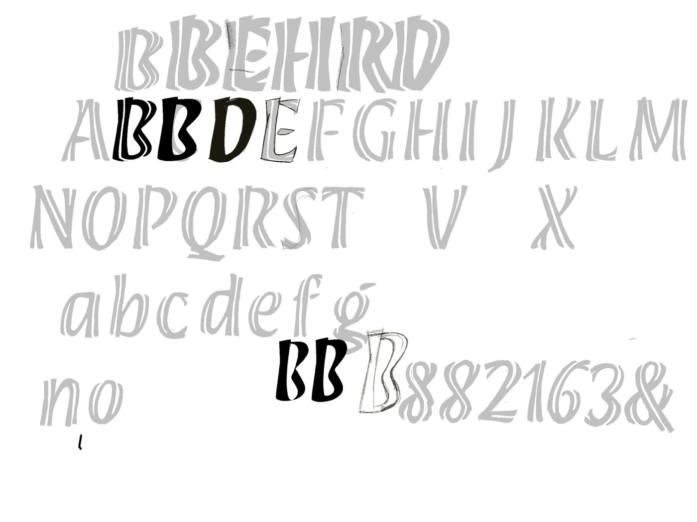
The forms in the initial sketches were visually striking and full of charm, with high contrast and a strong sense of dynamism, yet I struggled to make the system function as a cohesive whole. Some letters, particularly in the lowercase, felt unfamiliar and underdeveloped. As a result, I chose to sacrifice some of the contrast and refine the proportions to achieve a more harmonious and practical system.
From there, my process shifted. Instead of simply digitizing every brushstroke, I focused on a more structured approach to modulation and contrast. The brush was still a reference, but I gradually let go of its direct influence, allowing Raketa to develop its own logic and rhythm.
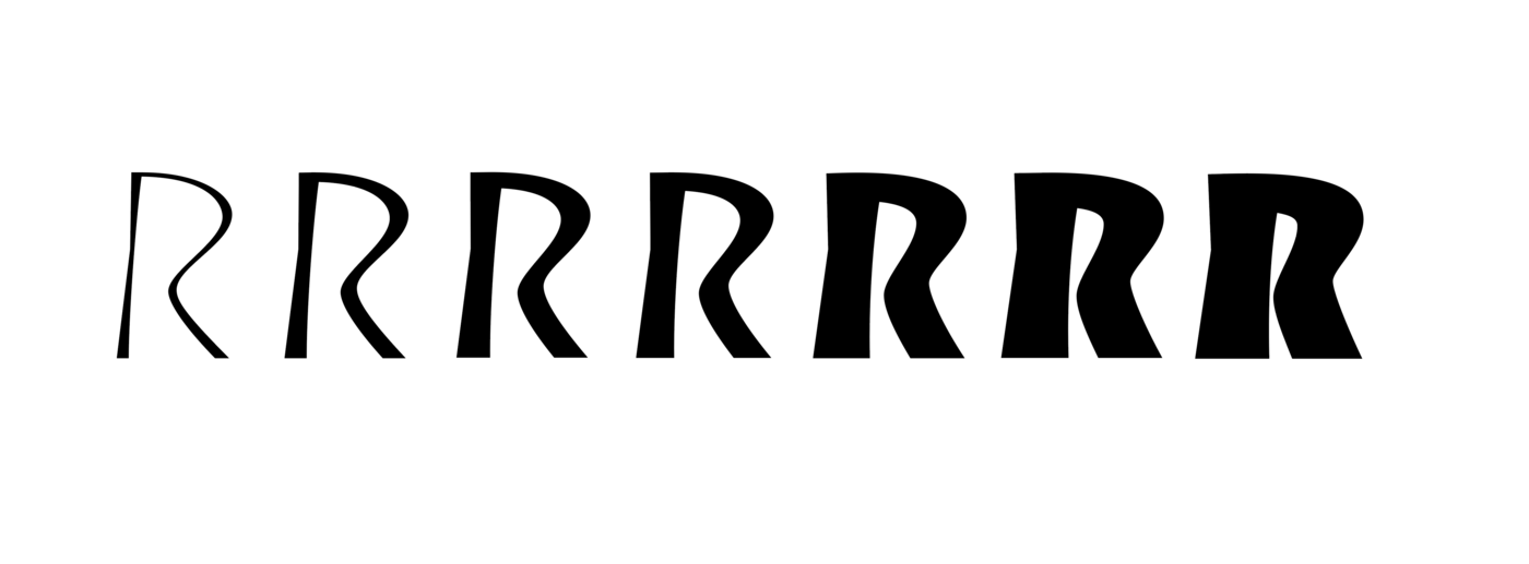
That shift was freeing—it let me see letterforms from a new perspective, less about replication and more about intention.
In the end, designing Raketa became as much an exercise in restraint as in creativity. It raised big questions about influence versus originality, adaptability versus consistency—all while staying connected to the deep traditions of calligraphy. It also made me think more about historical awareness, analytical decision-making, and the importance of a thoughtful design process.